Flow By Plumelabs
A brand new map experience
A brand new map experience
Product Designer @Plumelabs
Collaboration with Alexis Boyer
Product Designer @Plumelabs
Collaboration with Alexis Boyer
Product Designer @Plumelabs
Collaboration with Alexis Boyer
Product Designer @Plumelabs
Collaboration with Alexis Boyer
Product Designer @Plumelabs
Collaboration with Alexis Boyer
In 2014, Plumelabs was created to make air quality information accessible and empowering for everyone by simply connecting a device called Flow to your smartphone. Flow makes air quality transparent by showing you what pollutant you are exposed to. After Flow got commercialized, it naturally occurred to the team to implement pollution maps inside the application: maps are universal products that everyone is aware of, what better than having maps to visualize air quality data?
Our maps product was released before I joined in 2019. I was then part of the redesign of the new Plume labs maps experience.
Our longer term goals:
Our longer term goals:
- Create visually appealing and actionable maps.
- Give users more control of the air they breath.
- Build and gather a community that is engaged towards pollution.
First of all
First of all
First of all
First of all
First of all
My role during this
project
My role during this project
I majorarly led the design of our map products starting january 2019 as a product designer and collaborated directly with my head of design who was overseeing the progress of the project.
Additionally, I worked with iOS and Android developpers, data and athmospheric scientists and the hardware team.
When I stopped working on the project at the end of 2019, I finished designing the product and put together a high-fidelity prototype ready to be tested. The company decided to first release the map product through a web version and later on integrated it for free for our air report users.
When I stopped working on the project at the end of 2019, I finished designing the product and put together a high-fidelity prototype ready to be tested. The company decided to first release the map product through a web version and later on integrated it for free for our air report users.
Back To When It All Started
Back To When It All Started
Understanding the context
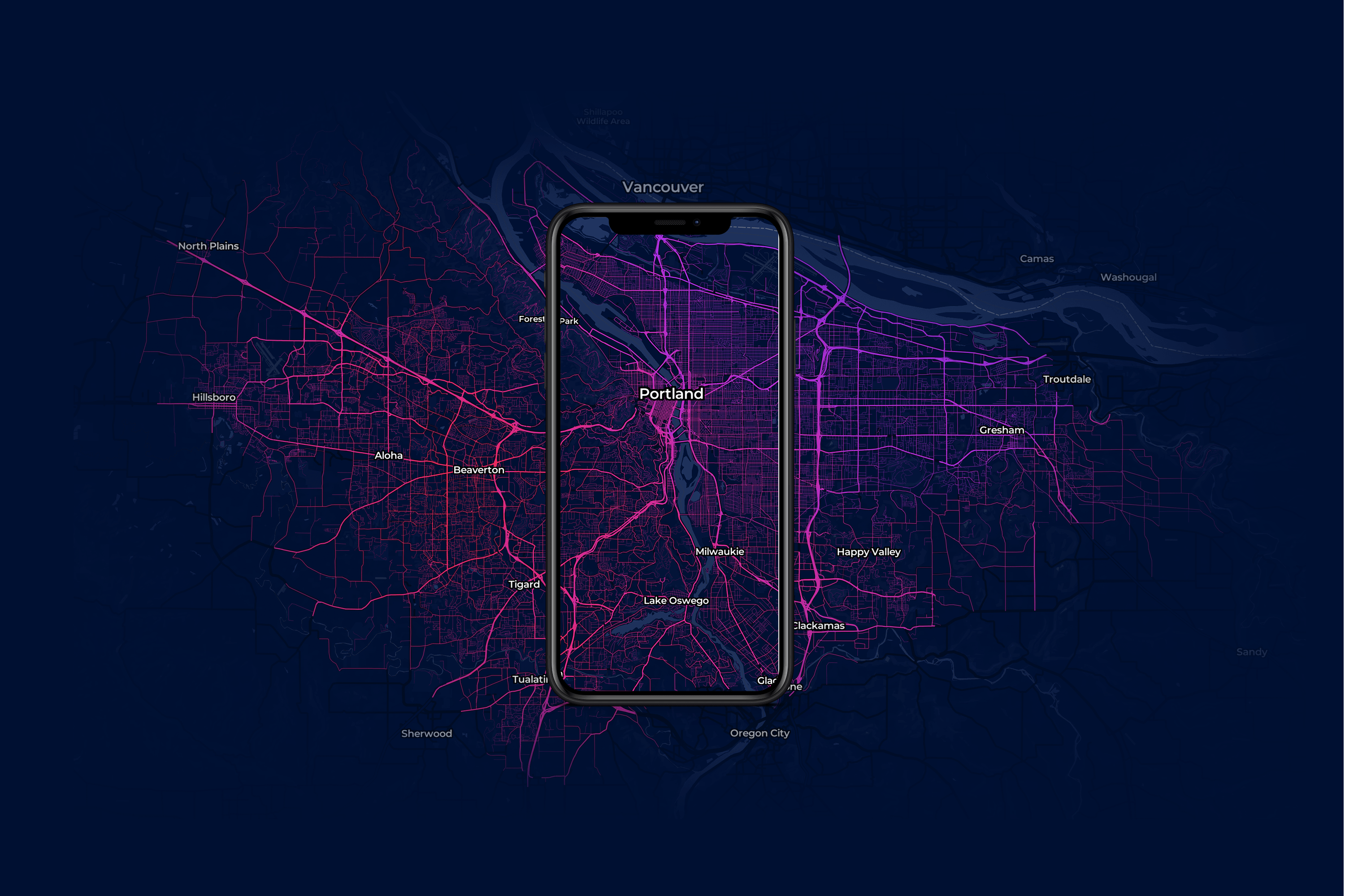
Our team developed the "Street Level Maps" in order to provide a better granularity for our users so they could see what the pollution looked like every hour and street by street.
Although being innovative, our maps were losing their charm shortly after it was released. At that time, displaying street by street pollution of a few cities felt more like a gadget rather than a feature that could be serving the purpose of thousands of our customers.
Our application also struggled to grow alongside our users' expectations. From technical issues to too few features. I was in the urge to think of a way to make these Street Level Maps more actionnable, intuitive and useful.
Our application also struggled to grow alongside our users' expectations. From technical issues to too few features. I was in the urge to think of a way to make these Street Level Maps more actionnable, intuitive and useful.
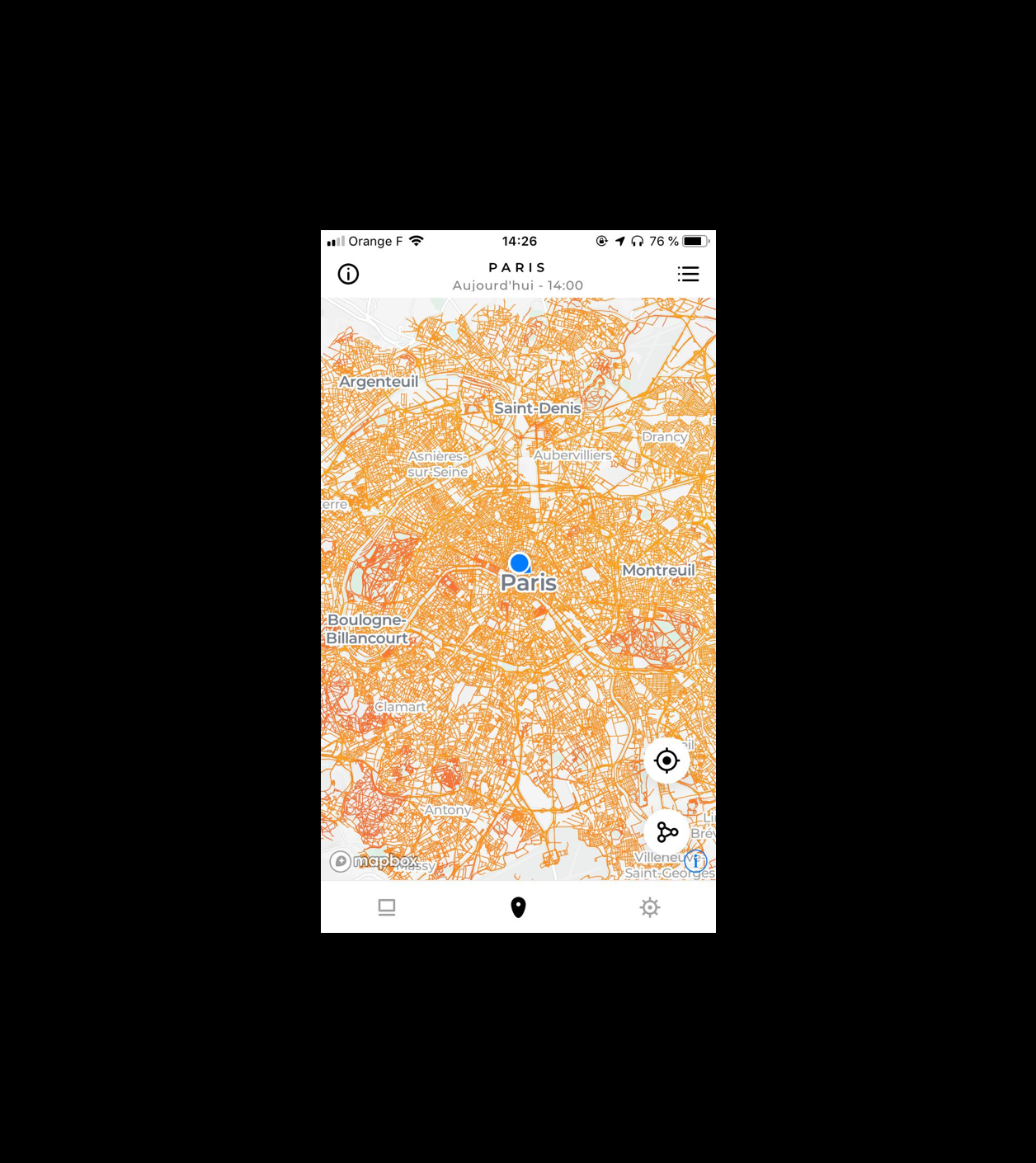
Paris street level maps after it was released.
Research Phase Kick-Off
Getting to know our
users better
Digging into our NPS from the past 6 months
Digging into our NPS from the past 6 months
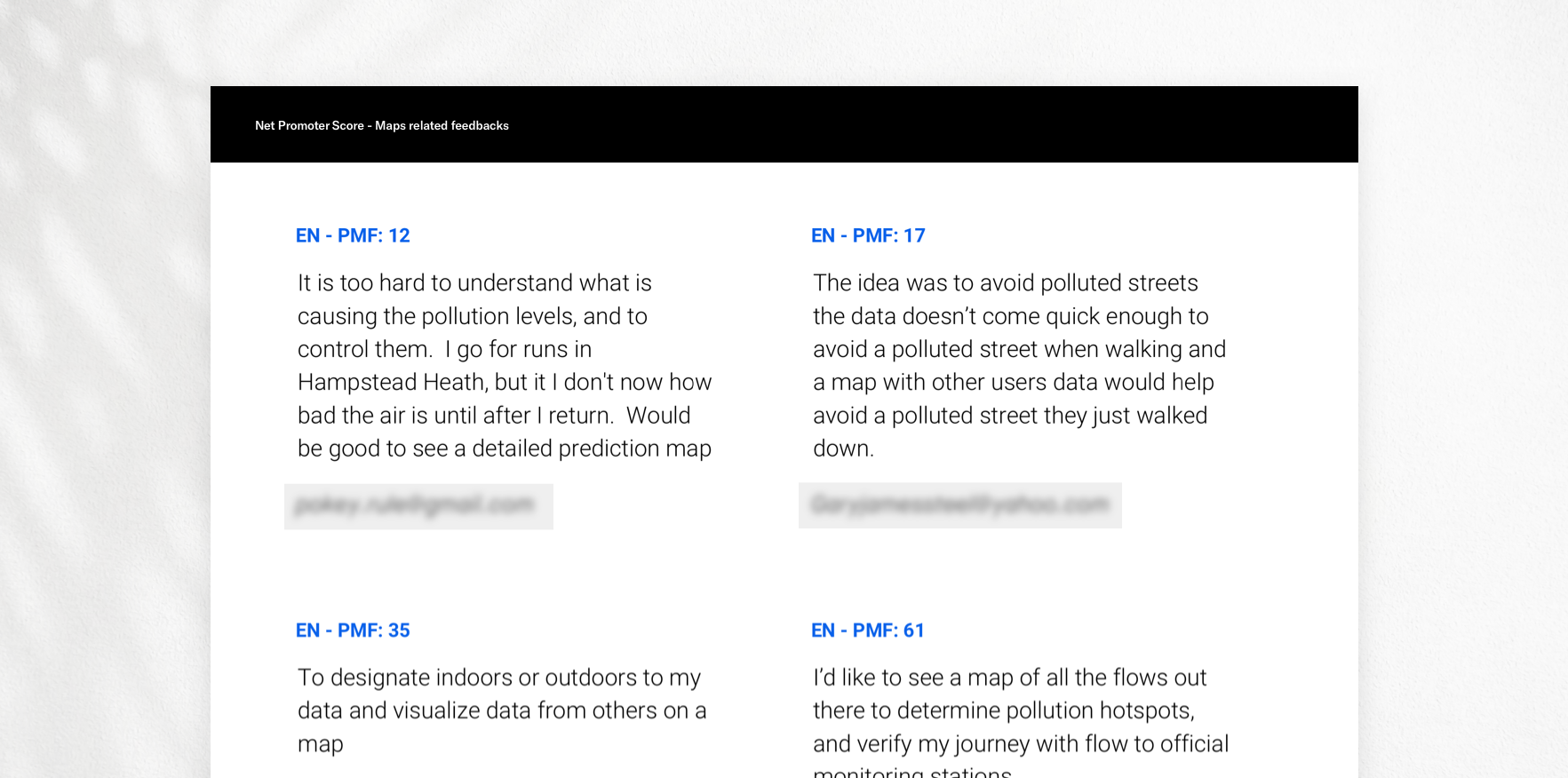
Rather than just giving us a simple score related to customer loyalty, our NPS was associated with closed-ended questions regarding specific topics of the product and an open-ended question allowing users to express their opinions.
I first focused on regrouping insightful feedbacks about our maps and started filtering and classifying them into groups of common subjects. I managed to order them in terms of priority based on the amount of requests made.
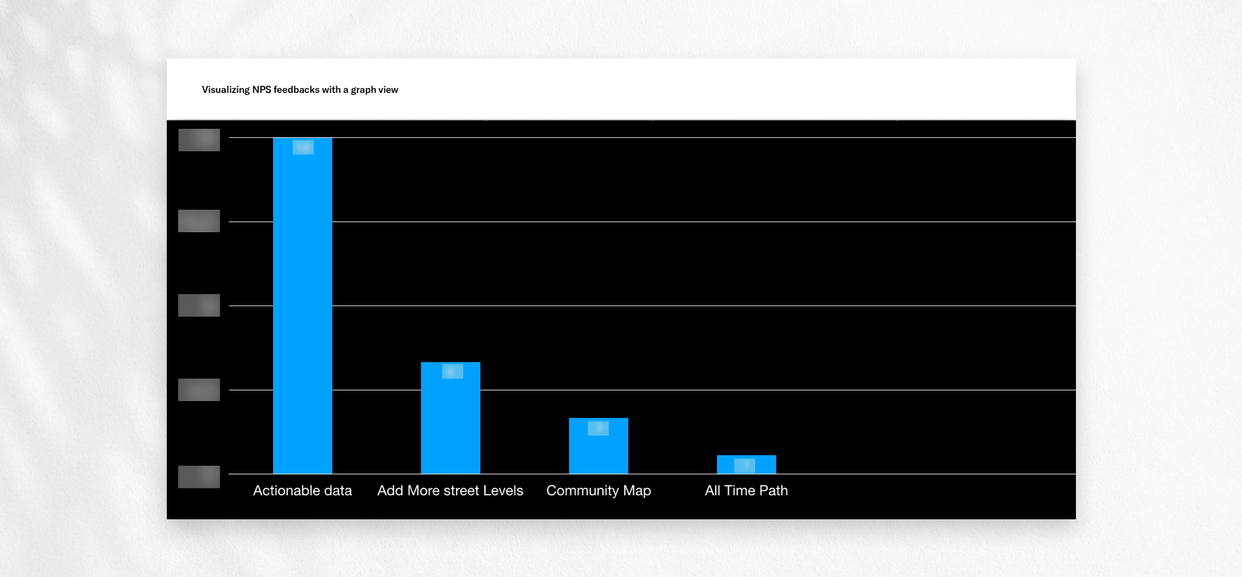
Looking at my NPS findings
Looking at my NPS findings
Our users' feedbacks were majorly pointing towards the same direction. What I call "Actionable data" are ways that can help the users act on the data we provide to improve their exposure to pollution: predictions, pollutant breakdown, "decision making" tools.
I had my initial hypothesis regarding their objectives that I had to confirm during user interviews. It was also interesting to see how engaged they were when it came to contribute their data to the community.
Research Phase Development
Research Phase Development
Research Phase Development
Discovery through user interview
Thanks to the NPS study, we reached out to the list of users who provided us their feedbacks regarding our maps. We also sent out a survey to recruit potential users to interview.
User research findings: 8 users were interviewed.
User research findings: 8 users were interviewed.
Surprisingly, users were most of the time talking about having a crowdsourced map with the possibility to see other users' data like we have on the Waze application. Most importantly, they were really eager to have access to shared data from others.
The main reason is that they are looking to anticipate, optimize and therefore improve their health by lowering their exposure to pollution.
To conclude, our users are looking to get ahead of pollution and hoped our maps could help in achieving these goals.
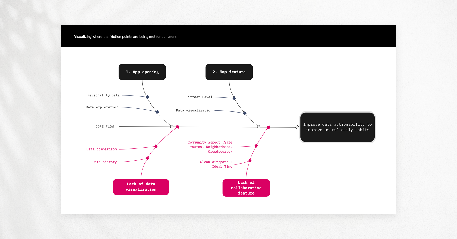
Overall flow
Overall flow
Our mobile application was pretty simple to use. In terms of flow I wanted to situate where the "global" friction points were happening during the use of it.
The interviews also helped me unveiling further insights regarding how we could improve our users' experience with the personal data they track.
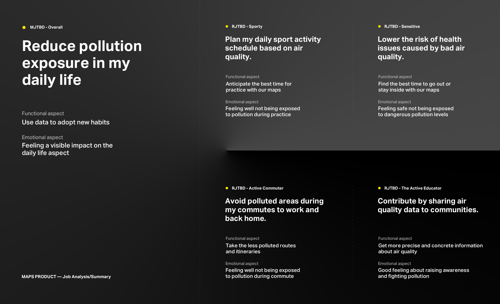
Focusing on the jobs
Focusing on the jobs
I composed these 'jobs to be done' based on the interviewees' feedbacks. Most of these statements will help in estimating if the solutions proposed are leaning towards the right direction.
Research key takeways
Research key takeways
- Help our users achieve their jobs.
From a design perspective, this would be defined by bringing forecast capabilities into our maps. - Help our users read our air quality measures easier.
This can be achieved by presenting air quality values in an intuitive way.
- Display more information and hints.
Our users want to be educated to adopt better behaviors. Including more informational content can be a huge plus. - Make our users an active contributor of the community.
Simply allow our users to trigger the sharing of their Flow data to other in the communities.
Reframing The Problem
How might we help our users plan and optimize their days when it comes to air quality?
How might we help our users plan and optimize their days when it comes to air quality?
There is a subsisting issue for our users when it comes to taking actions to deal with pollution. At this time, they rely on personal data which is either focused on the present moment or already passed.
It leads to frustration as they find it quite difficult to act on it since they have to do most of the work by themselves when it comes to studying it, and understanding it.
Competitive Research
Conducting a functional benchmark
I have established a benchmark of all our competitors on the market based on the functionnalities they would offer regarding their pollution map. The idea behind is to first assess what we offer and how our data is being used versus others. What was pretty clear here is that the whole competition was more or less offering the same value.
The only difference is that some might have more precise data or offer better forecasts for instance. In our case it was getting clearer for me to keep building our engagement around the Street Level Maps.
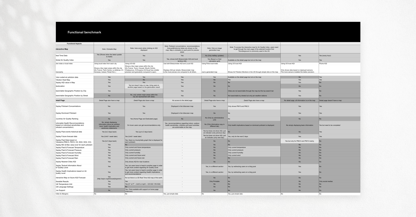
I narrowed down my benchmark to a few main actors that had high quality maps product and a great presence on the market. These were competitors with an important amount of engaged and active users.
I went into testing their products and managed to discern two main issues and opportunities we could work on.
Benchmark key takeways
Benchmark key takeways
- Pollution Heatmaps are often confusing in the way they are presented.
Numbers are visually flooding the maps and it tends to be difficult to have an idea of what location the value is representing. It is absolutely necessary for me to find a design alternative for this matter. - Pollution heatmaps are good, but way too general.
This reinforced my previous idea of designing forecast capabilities within our maps. All our competitors are having general heatmaps, however they lack of context for our users as per our research results.
Time & Resources
Prioritizing and
planning
I wrote down the potential ideas we would focus on to craft a better experience. I set up a meeting with the data scientists and development team in order to assess what could be done.
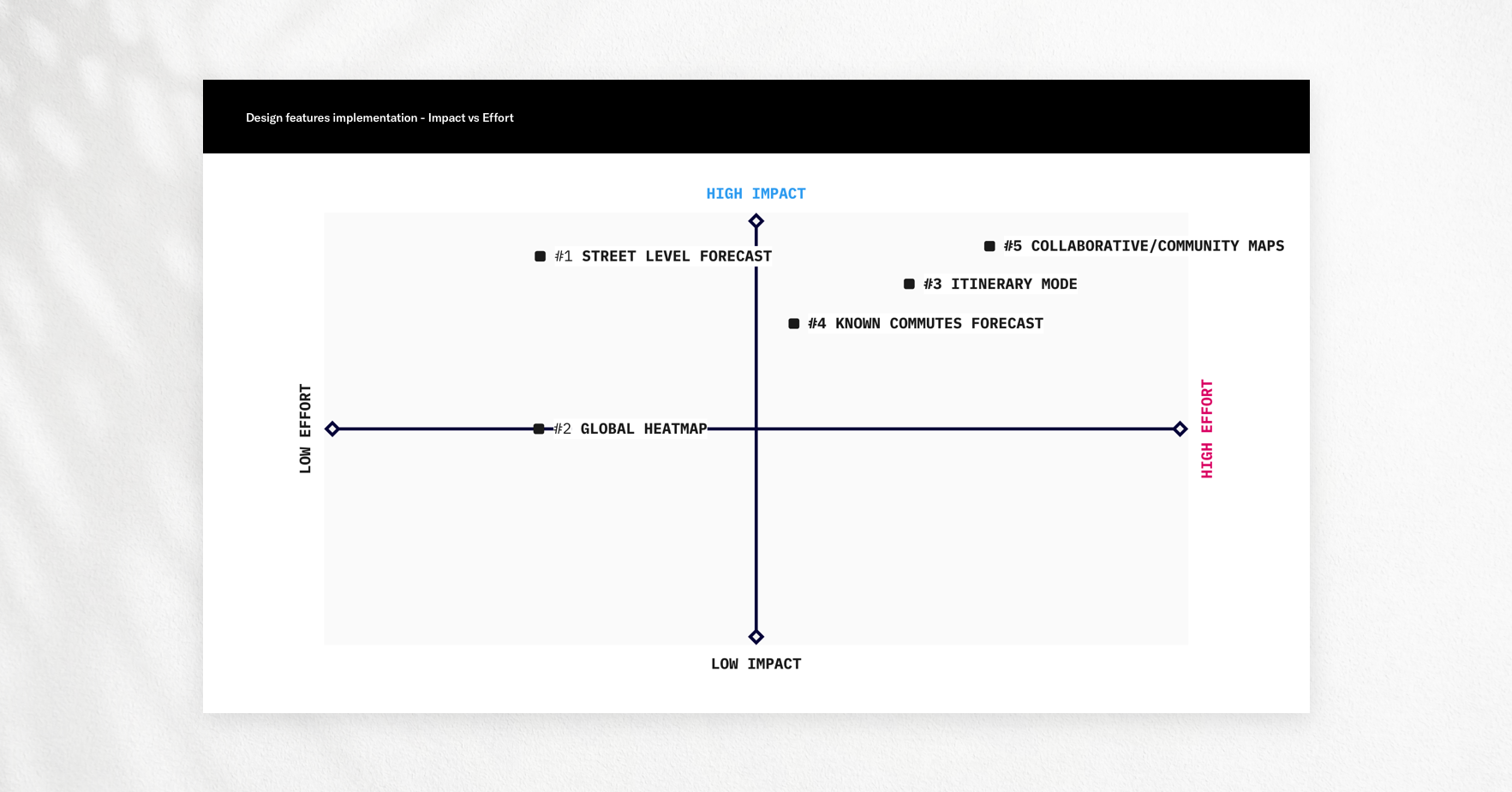
Recap of design decisions
Recap of design decisions
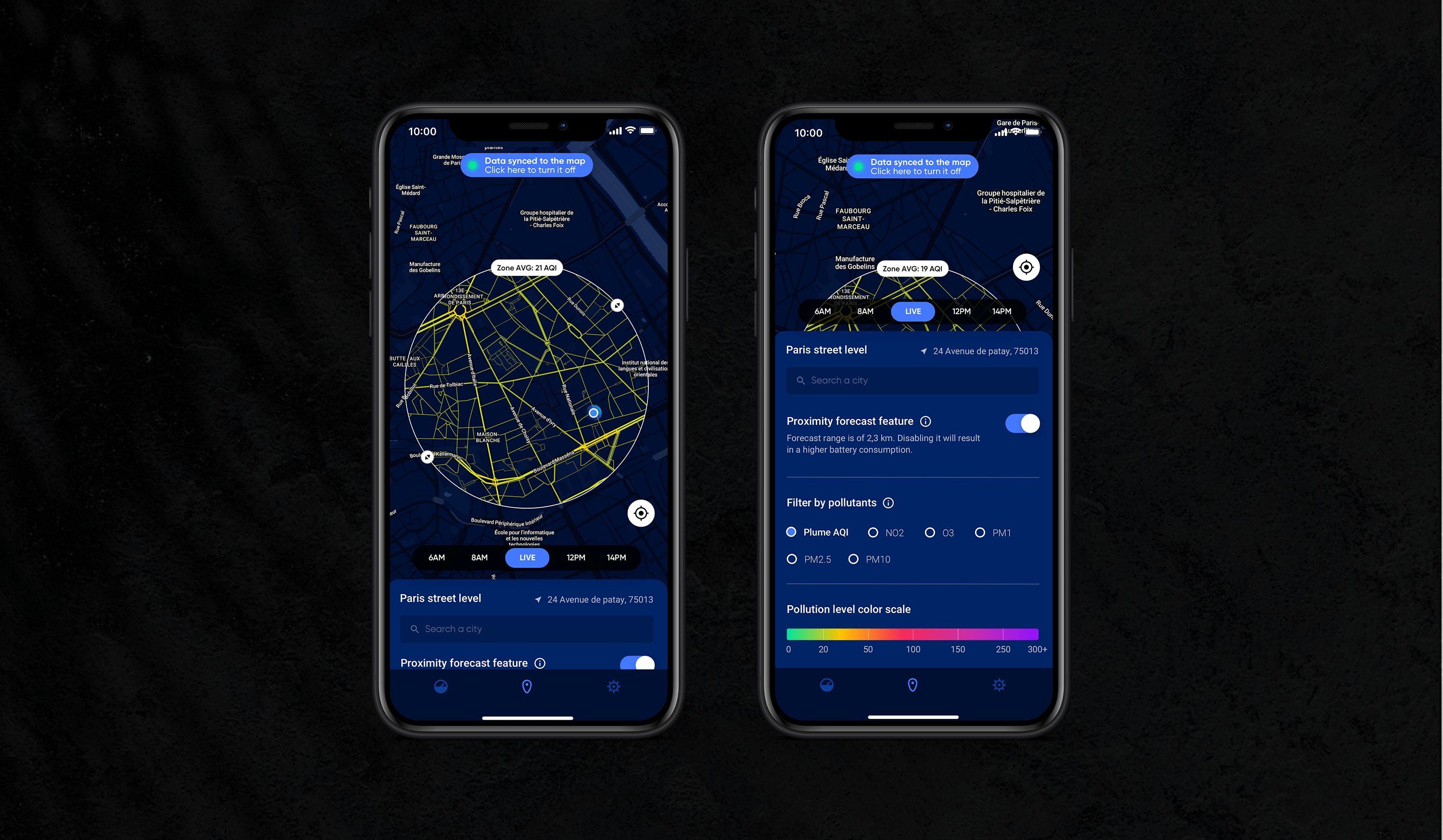
- Design a forecast tool for our users.
Research unveiled the absolute necessity to integrate this component inside our maps.
I believe this will bring a lot of value. - Design dedicated sections to inform our users about the information displayed.
- Design an aesthetic and understandable heatmap.
This will require me to make more visual research about maps in general to find best practices, ideas and innovative ways to distinguish our work from the competition.
Solution & Conception
Designing a new flow
and structure
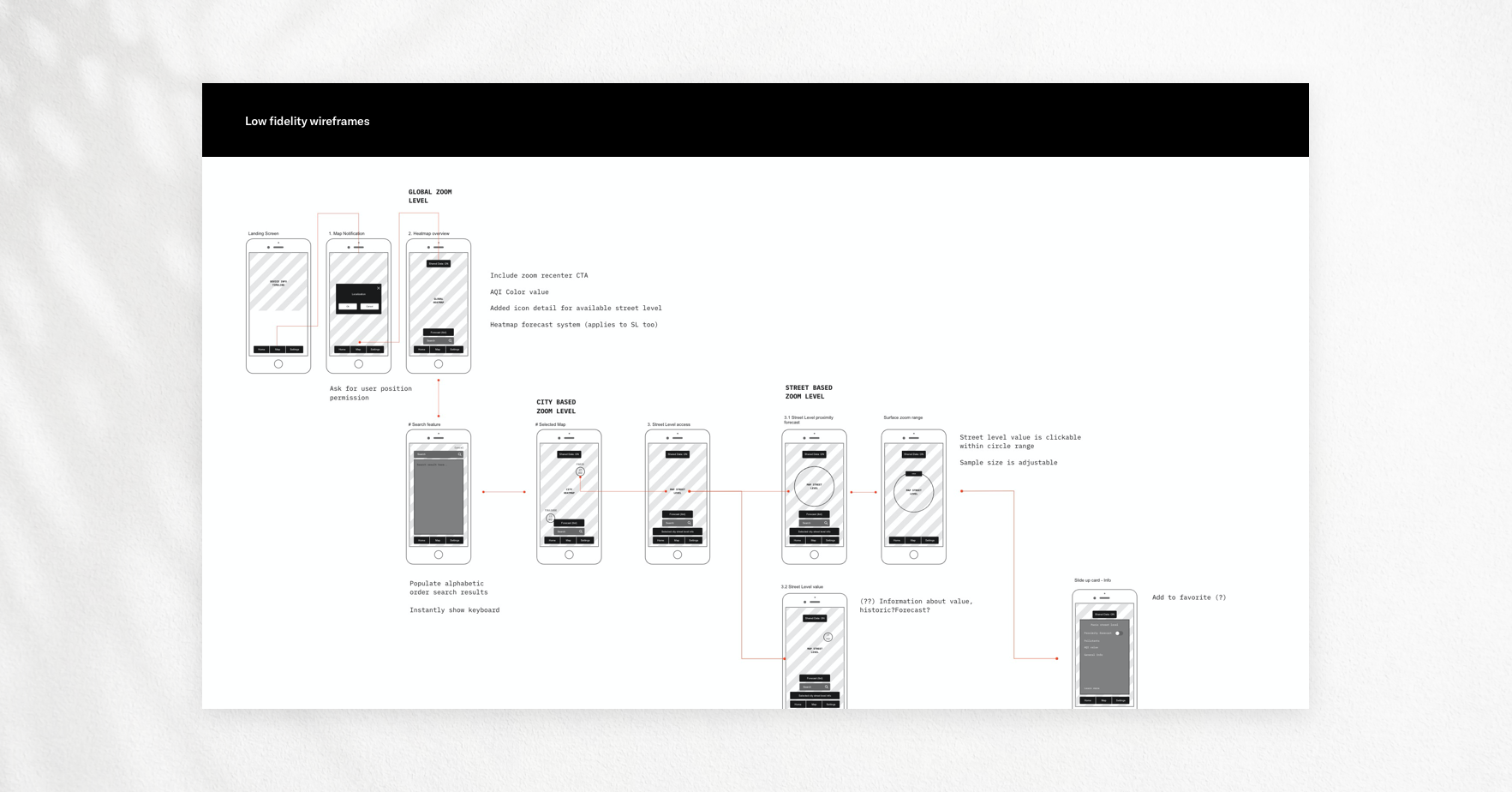
From sketches to initial wireframes, I started to picture what the flow would look like and what elements on the interface we wished to integrate. Based on that, I started to collaborate closely with the partner teams to make sure everyone was aligned with the initial objectives set earlier.
Solution design process
Solution design process
- Low-fi wireframes to validate the initial flow internally
Visual research and inspiration for Street Level designs and heatmap
Street Level Redesign and implementation
Mobile design with newly integrated Street Levels
Visual Research And Map Design
Creating The Maps Guidelines And Design
Gathering inspiration over the web was the first step. Thanks to these, I started to elaborate my design of our maps and began redesigning our Street Levels based on specific elements such as the width, color, opacity, the zoom level and other parameters on Mapbox.
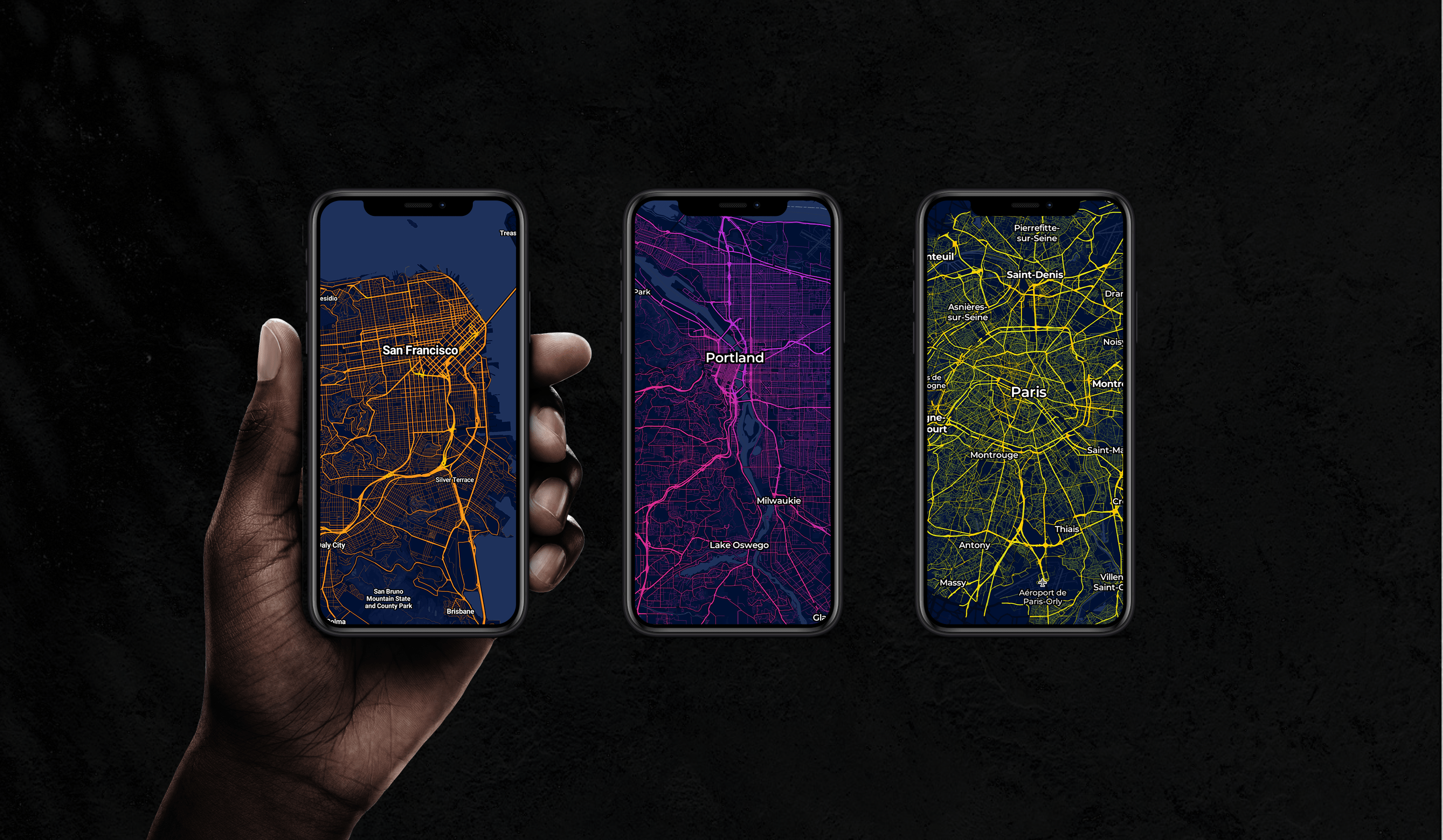
They were many iterations made on the map design in general, by the end we have had two types of modes for our maps: one light mode and one dark mode. It took some time to design and iterate on the Street Level maps as we needed it to be coherent through every city we had data for.
Map design inspiration moodboard (Street Levels & Heatmaps)
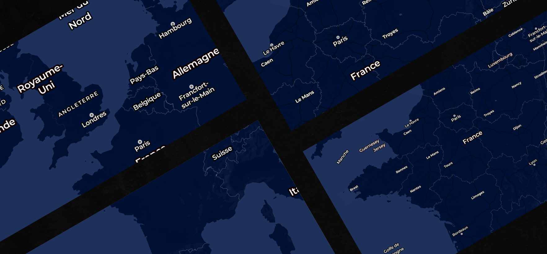
Designing the base of our maps: colors (cities, sea, countries, borders, labels..)
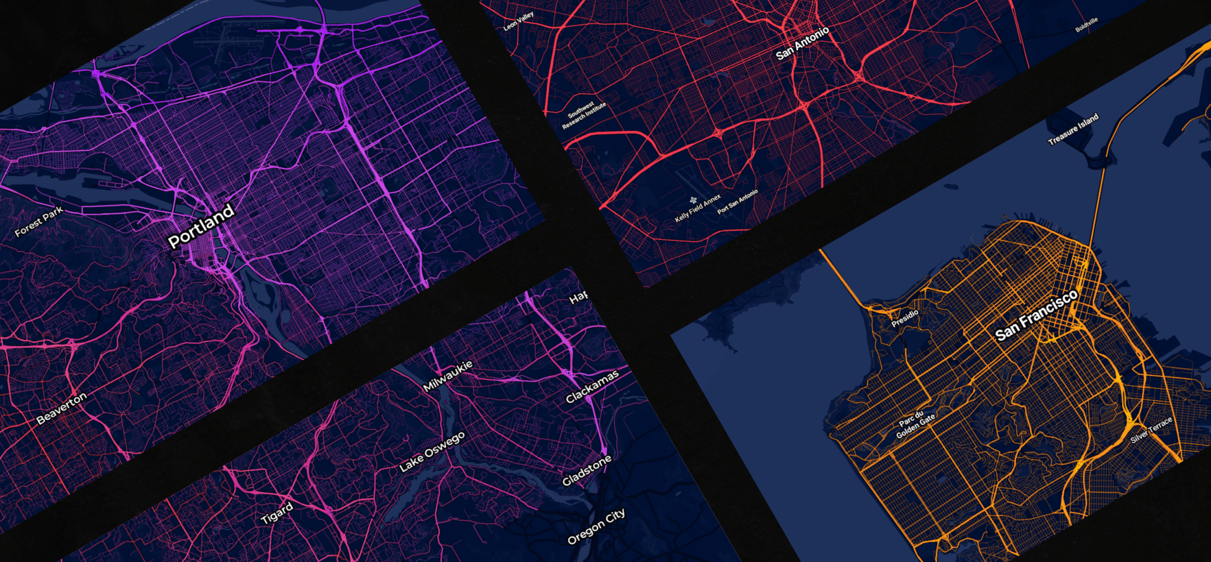
Designing the core of our maps: the Street Levels (Zoom levels, Width, Color scale, Opacity..)


Final concepts
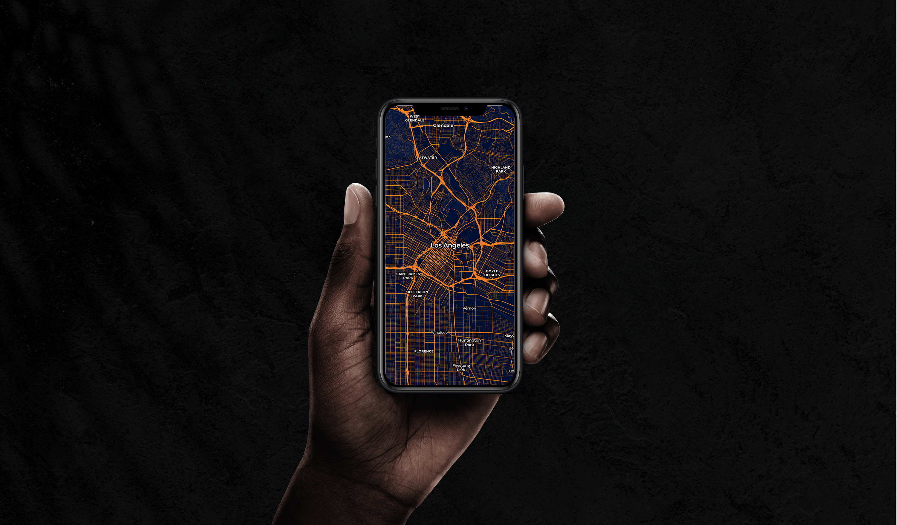
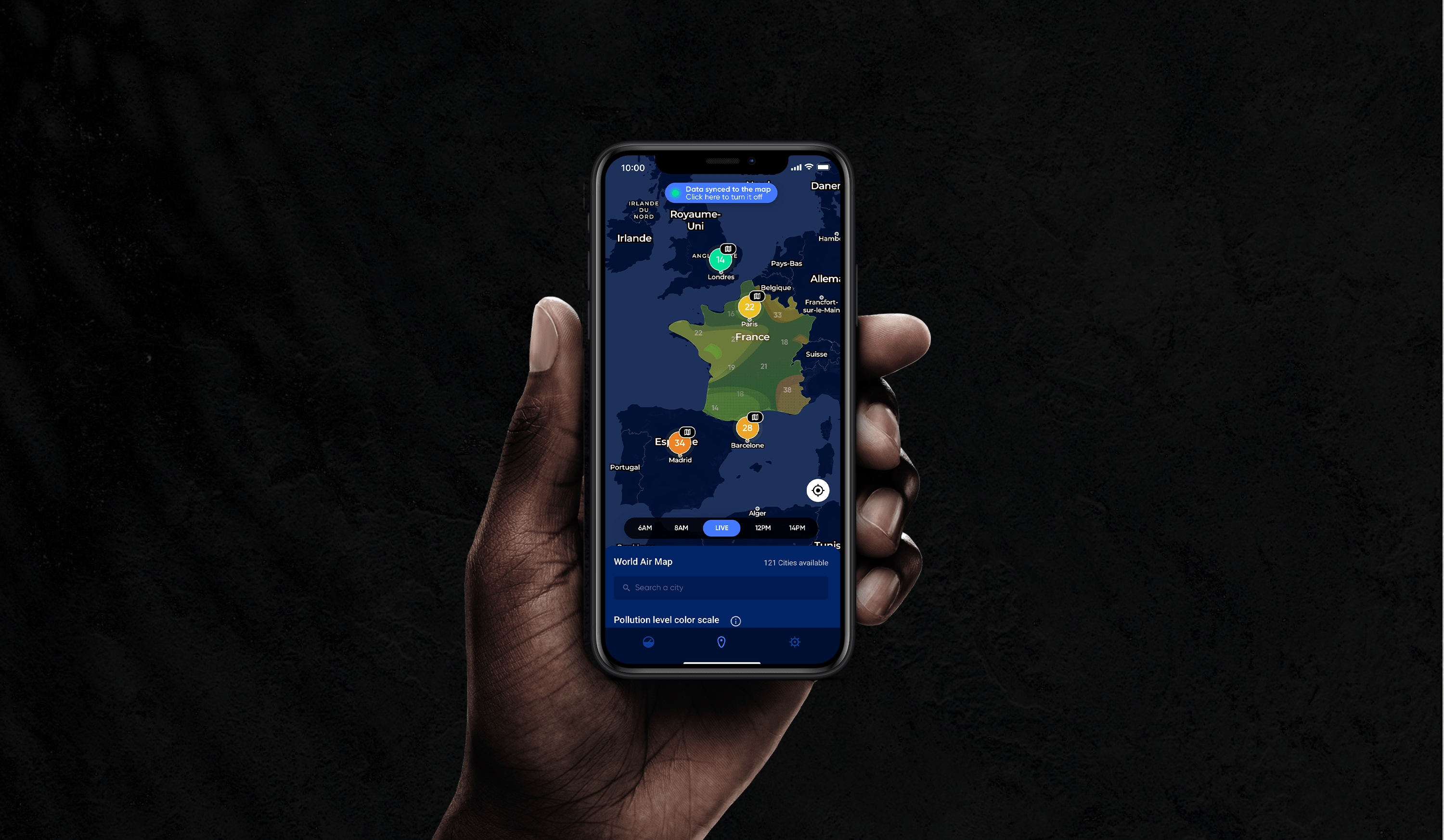
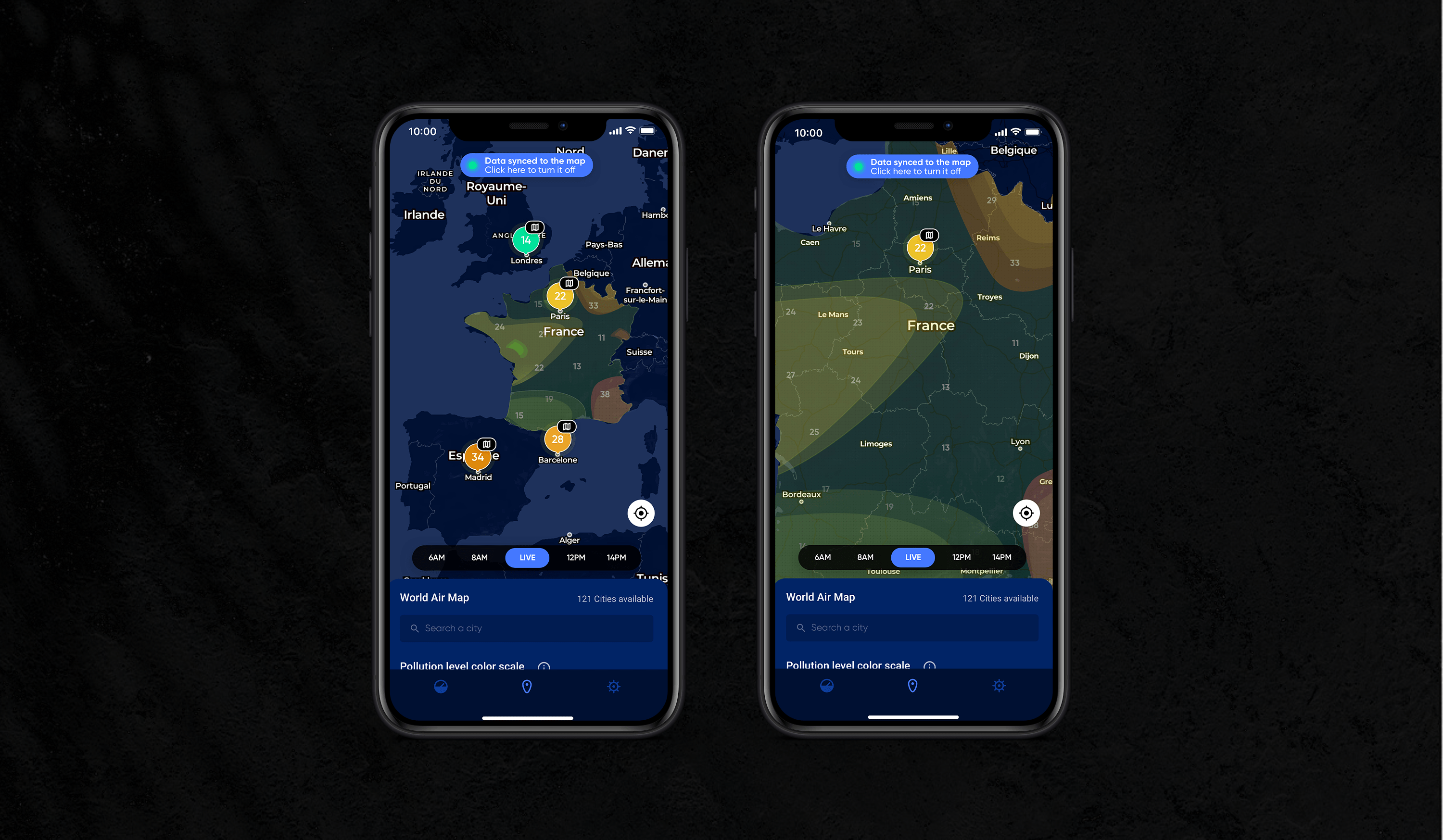
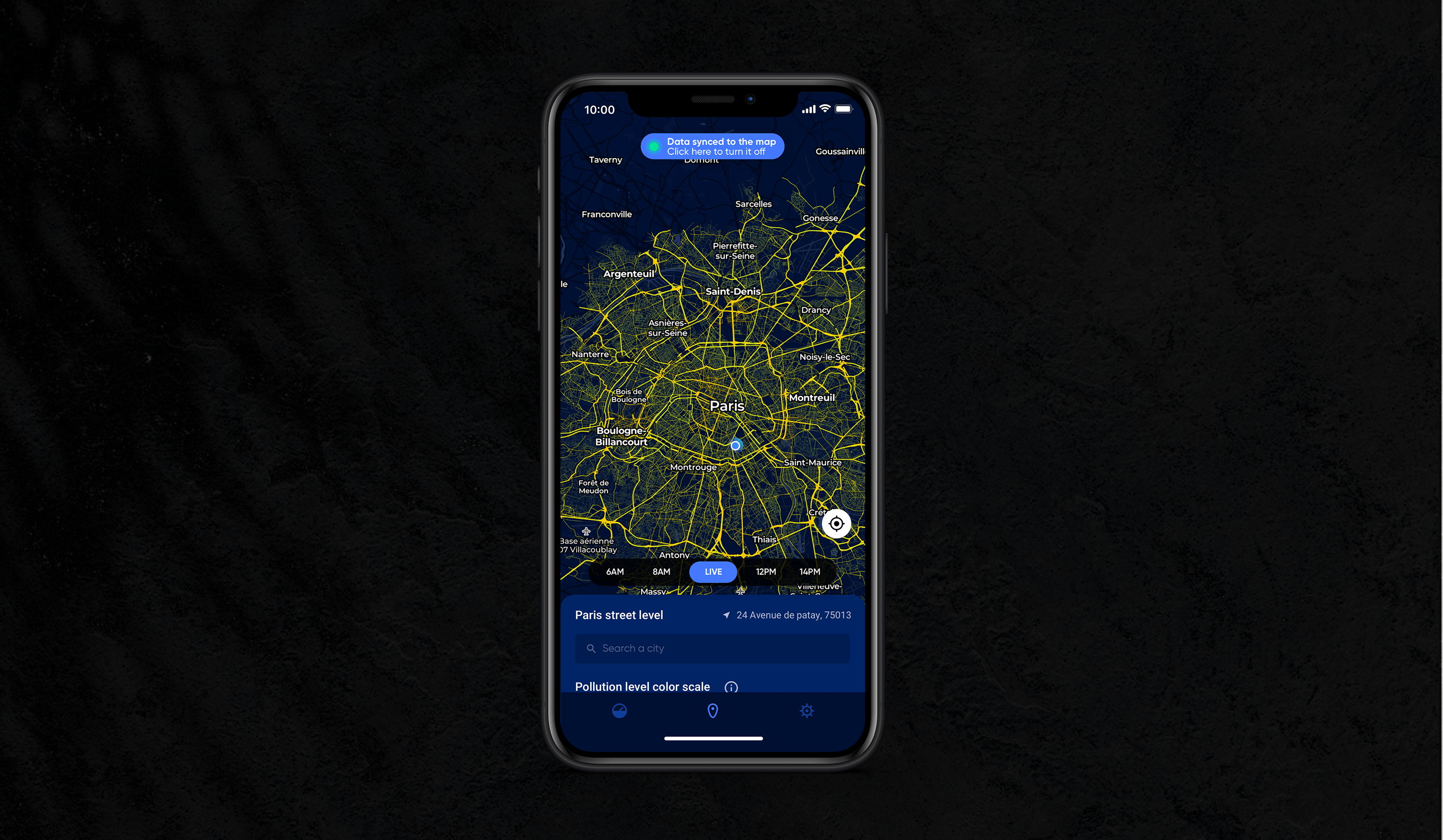
Introducing Plume Air Quality Maps
After I have initiated the first concepts, the team priority shifted on redesigning our current apps with a brand new style and design. We adopted the dark mode as we worked towards a new art direction. Therefore, this new style applied to the map exploration. The final result is a polished and clear design of our air quality maps.
Further to implementation
Measuring success
I paired with our product manager to keep track of our product's performance after it will be released.
Key metrics
Key metrics
Retention rate
Time spent on the product
Churn rate of
Improved NPS
Search and forecast tool usage
Most visited cities
Retention rate
Time spent on the product
Churn rate of
Improved NPS
Search and forecast tool usage
Most visited cities
Data syncing enabled/disabled
Proximity Forecast feature
Pollutants filter
Shared maps on social media by users
*Press and media impact*
Conclusion
Help Plumelabs in becoming
a reference when it comes
to air quality.
Help Plumelabs in becoming
a reference when it comes
to air quality.
The depth of the research on this project brought essential pain points around the current product. Not only was I able to tackle these problematics at the source, I was also able to push my reflexion further, giving me the opportunity to fully explore my concepts and have a longer term vision on the product.
The user test sessions conducted at the end were more than rewarding for me. Hearing our users positive feedbacks during these sessions really proved we managed to deal with many facets of the problems. The exictement generated around the street level forecast is something I consider an accomplishment.
I strongly believe the designed solutions will help in increasing the amount of active users in general but mostly create a positive impact on our users' daily life. The release of these improvements will be a good baseline for us to estimate what will be next.
Product update
The newly designed maps were first released to the public through a web version but also our Air Report free app (without all functionalities). It is satisfying to see the positive feedback we have received from the press and media in general since this would help the company in gaining visibility but also showing its expertise.