The Chan Zuckerberg Initiative
The Chan Zuckerberg Initiative
Creating a bold
and dynamic website
Creating a bold
and dynamic website
Interactive designer @Upperquad
In collaboration with Jason Dietrick, Kailie Parrish, Eliott Tran
Visit website
Interactive designer @Upperquad
In collaboration with Jason Dietrick, Kailie Parrish, Eliott Tran
Visit website
Interactive designer @Upperquad
In collaboration with
Jason Dietrick, Kailie Parrish, Eliott Tran
Visit website
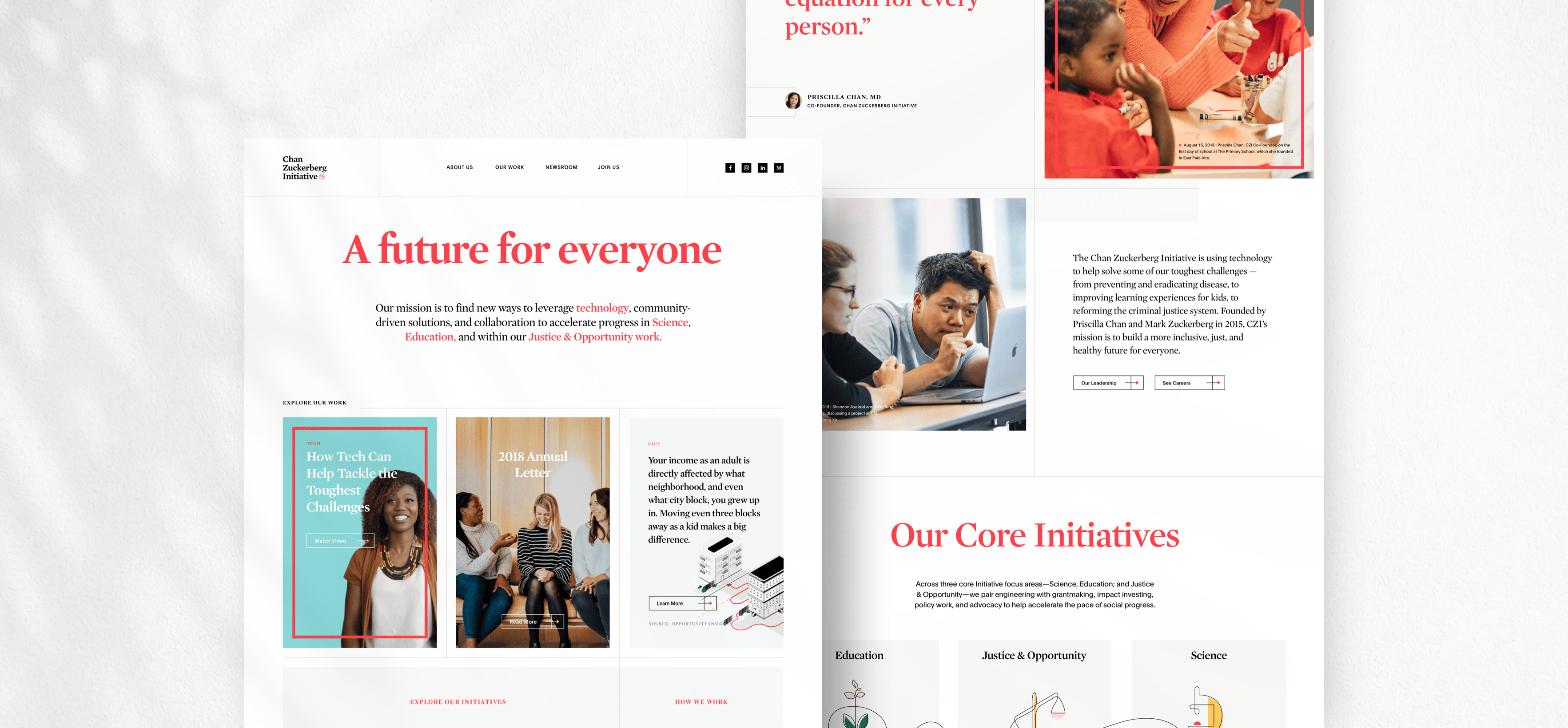
Founded in 2015, the Chan Zuckerberg Initiative is using technology to build a more inclusive, just, and healthy future for everyone. Our job at Upperquad was to differentiate CZI as a philanthropy at the intersection of social change and technology to amplify their ambitious vision and support it with tangible, meaningful stories.
Our core goals
- Articulate a cohesive and inspiring brand story.
- Attract talented, passionate employees from a wide range of backgrounds and fields.
- Represent and celebrate the diversity of CZI employees and the communities they serve.
First of all
First of all
First of all
First of all
First of all
My role during this
project
My role during this project
I integrated the design team at the beginning of the project and was part of the whole process from ideation to the conception of the solution.
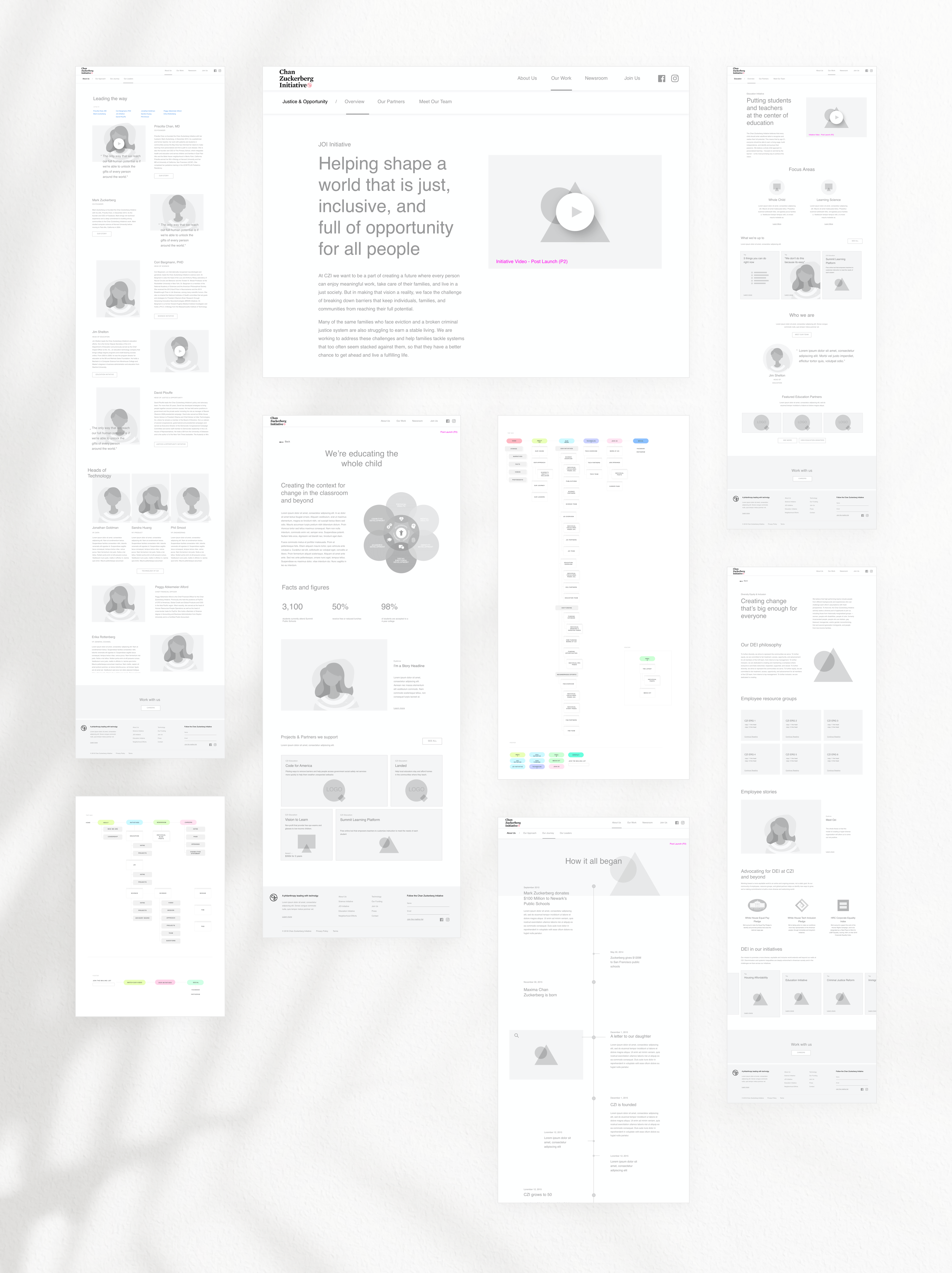
I was primarily focused on establishing design concepts as well as high fidelity wireframes, creating and maintaining the design system, but also implementing the responsive design of the whole platform.
I have had the chance to propose a design concept that was both approved by the client and the team.We ended up following my initial idea and worked together to push and produce high quality designs. During this project, I collaborated with a talented team that included lead and senior developpers, producers, creative and art directors but also the management team from client's side.
Research phase kick-off
Research Phase Kick-off
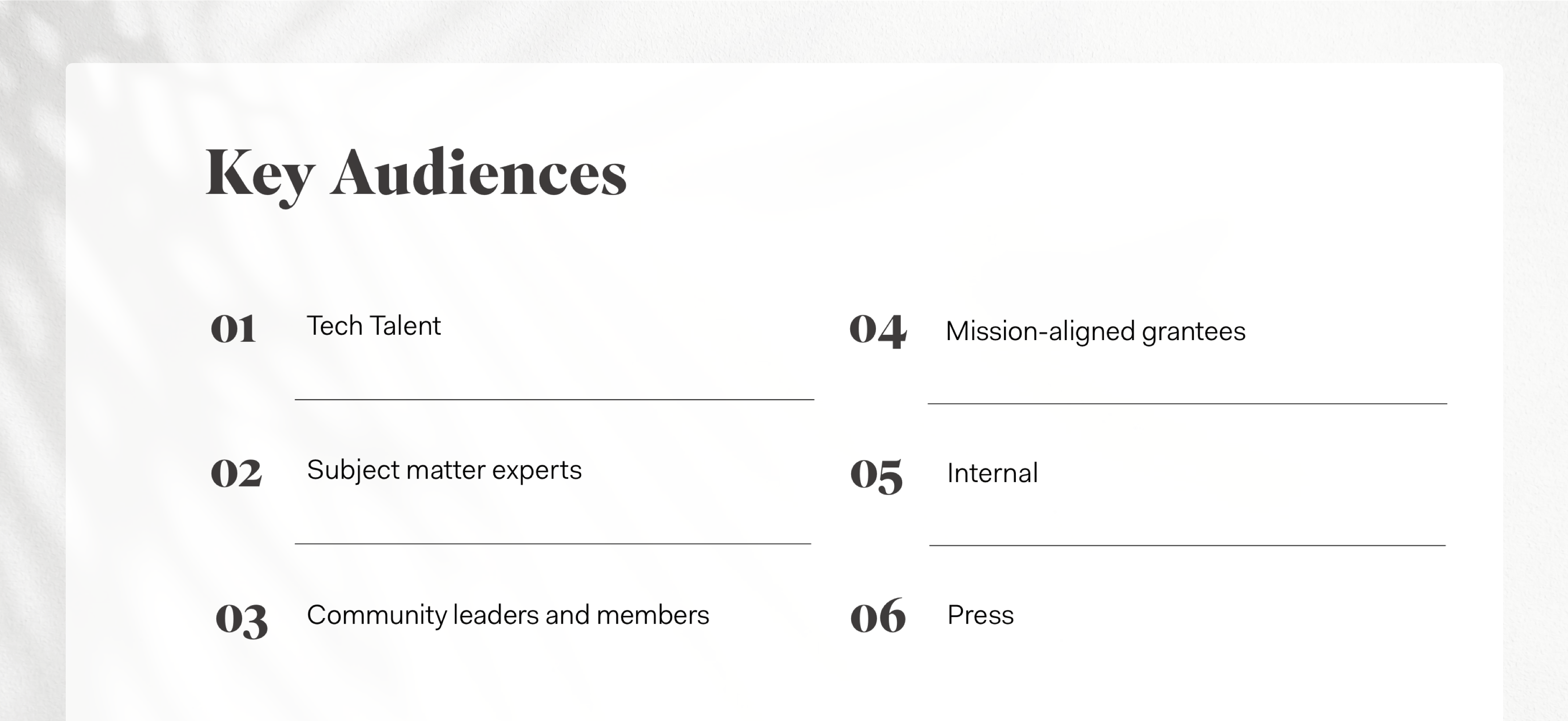
Understanding the audience
We have conducted on site interviews with people representing the main departments (we call them initiatives) of the company. The objective was to get to know better the specific community each department were adressing their messages to.
Also, we have been able to gather feedbacks regarding the strengths and challenges encountered by the current CZI website in general.
Our application also struggled to grow alongside our users' expectations. From technical issues to too few features. I was in the urge to think of a way to make these Street Level Maps more actionnable, intuitive and useful.
Early insights:
Navigation is limiting.
No hub for press resources.
- We need distance and distinction from Facebook.
Navigation is limiting.
No hub for press resources.
- We need distance and distinction from Facebook.
- No financial transparency.
- Limited photography and video assets.
- Specificity is lacking.
Digging Into The Subject
Industry benchmark
We gathered a list of pertinent tech companies and philanthropies so we could assess the main opportunities and recommendations around
our main objectives.
Tech key takeaways:
1. Feature a diverse group of people.
2. Balance levity and gravity carefully.
3. Highlight values prominently.
4. Create a dedicated space for diversity.
5. Humanize the organization with photography of people and spaces.
6. Make jobs accessible and navigable.
Philanthropy key takeaways:
1. Show the people that CZI works with.
2. Tell vivid stories to humanize efforts.
3. Distinguish CZI by developing a bold, distinct brand POV.
4. Use video where possible.
5. Emphasize News and Stories.
6. Be financially transparent.
Ideation Phase
Ideation Phase
Information architecture and wireframes
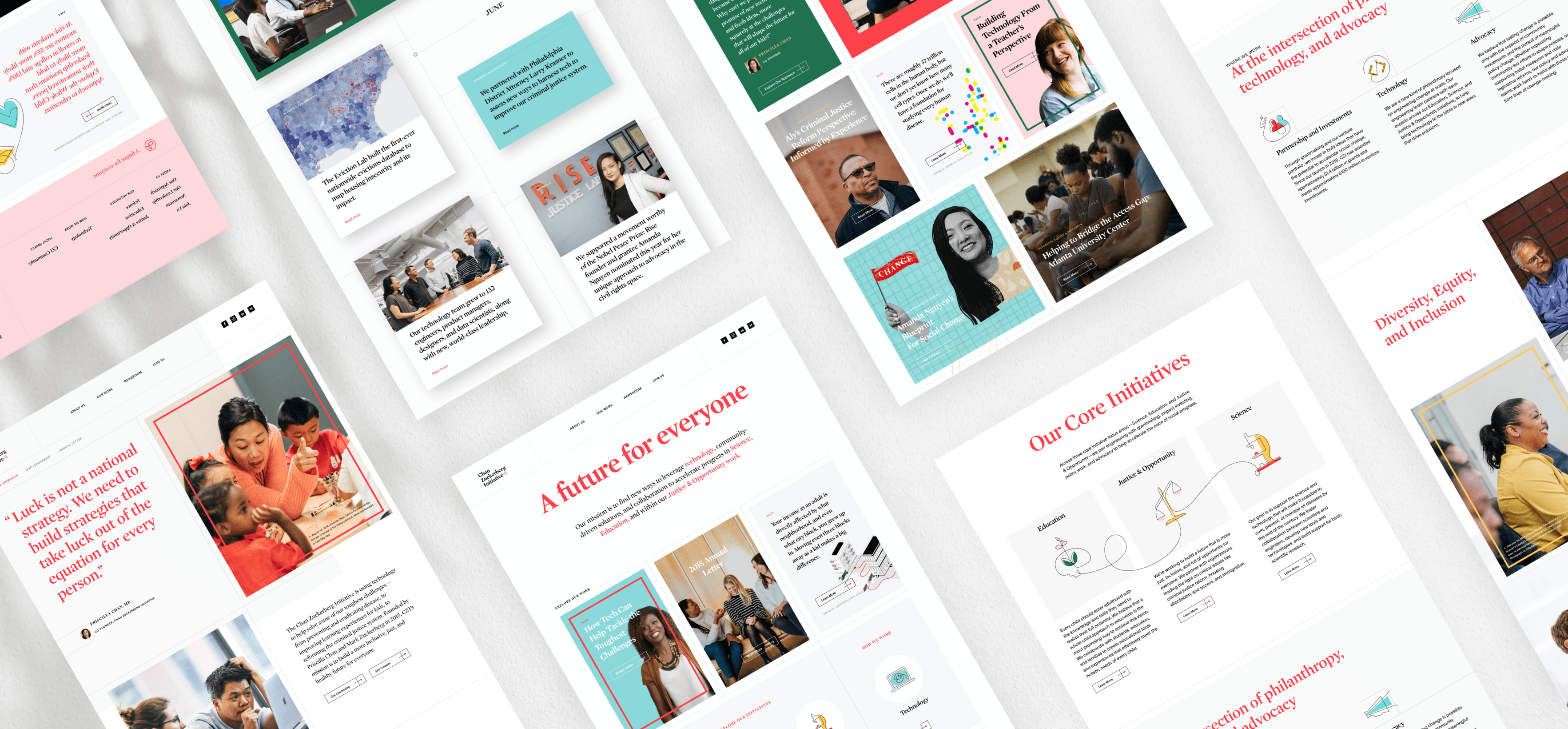
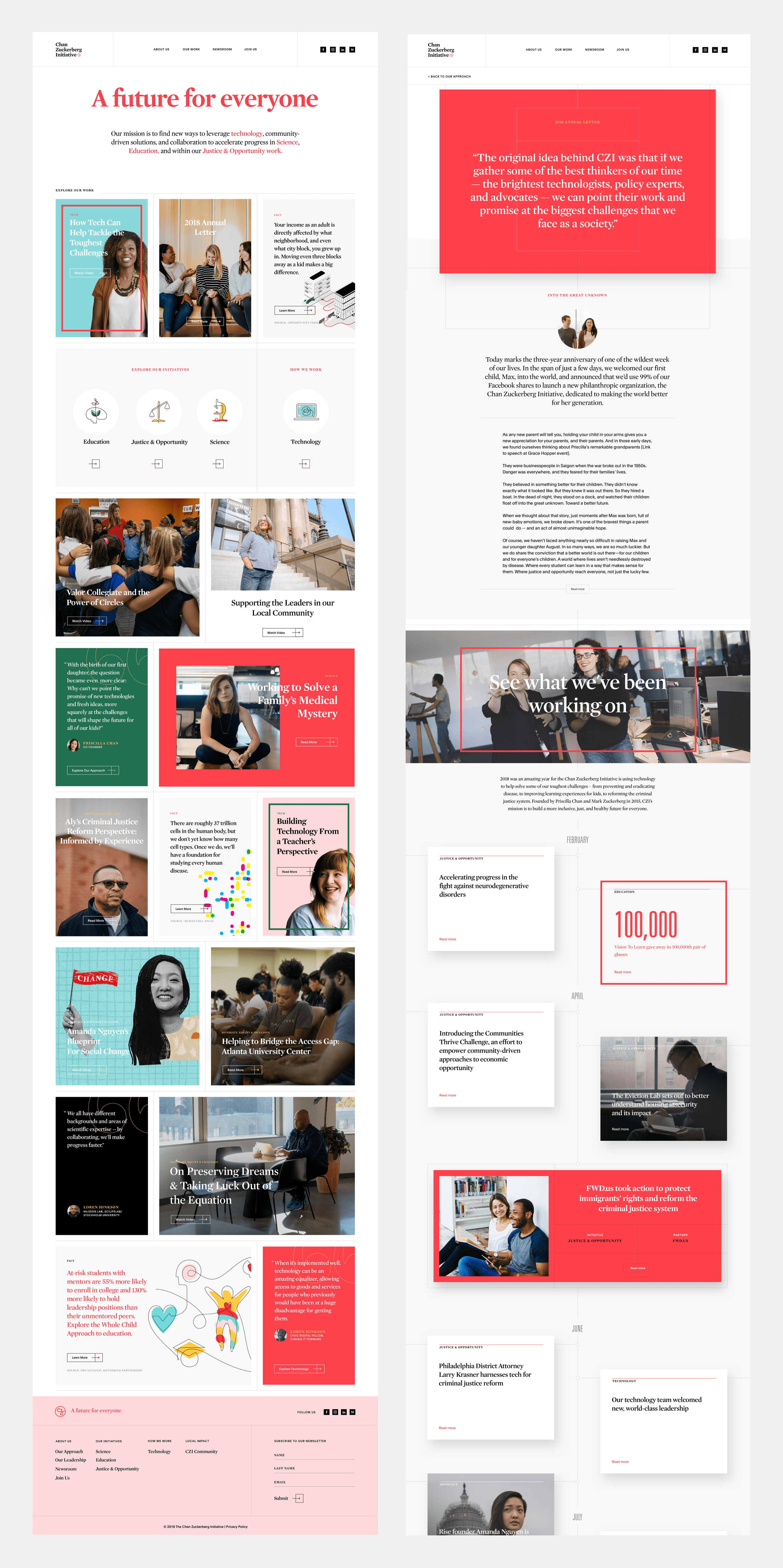
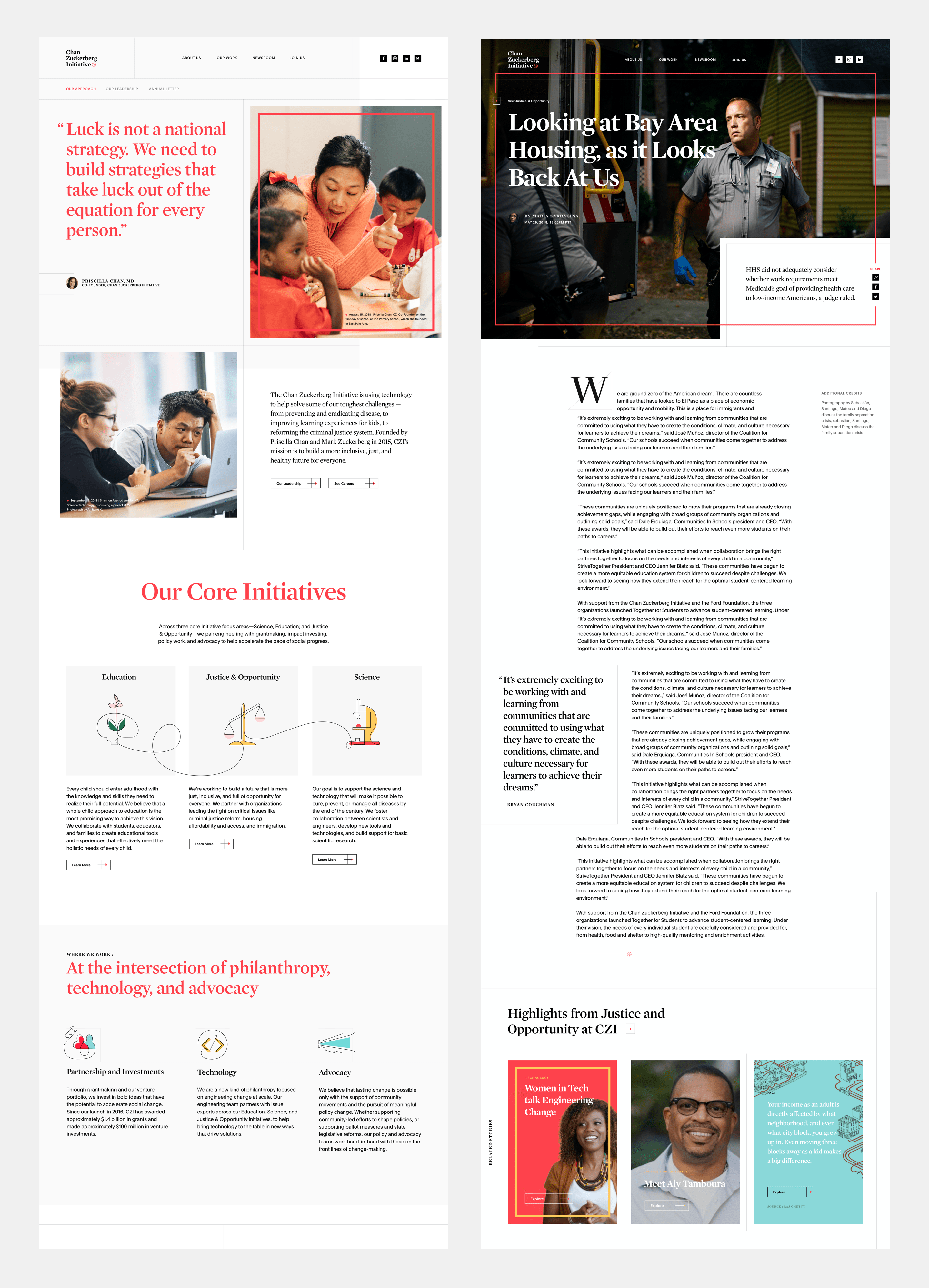
The research unveiled essential information about our client needs. The main focus was to celebrate CZI's diversity and emphasize its stories. To do so, we absolutely needed to design a place that would help in conveying all of these stories. Naturally we thought of the homepage to be the perfect place for this matter.
We then focused on how we could structure the new platform before sketching low-fi and hi-fi wireframes. I would work on refining the wireframes as much as possible in order to give the client a better view of what the final result would look like.
Our application also struggled to grow alongside our users' expectations. From technical issues to too few features. I was in the urge to think of a way to make these Street Level Maps more actionnable, intuitive and useful.
What we did to fix the problems found:
Reimagine and prototype a new navigation for a better experience.
Highlight diversity with high quality visuals showing spaces and people.
Create a dedicated sections for jobs to attract talent.
Reimagine and prototype a new navigation for a better experience.
Highlight diversity with high quality visuals showing spaces and people.
Create a dedicated sections for jobs to attract talent.
Create a hub for press sources.
Emphasize news and stories by creating a 'Story hub' on the homepage.
Create a distinctive and bold design that will carefully highlight the company's values.
Visual Research And Design
Visual Research And Design
Visual Research And Design
From editorial design to modern interfaces
As we wanted to focus the platform around the stories told by CZI employees and the community they interact with, I based my visual inspiration research around clearly articulated interfaces such as magazines, newspapers, layouts with harmonious typography and grid.. I set my research around both digital and physical support.
My objective was to figure out what I could do to get the best of both worlds. I was looking to put forward the imagery and content of our photos but also to distinctly display our written content.
Visual Design Exploration
Visual Design Exploration
Imagining colorful and dynamic layouts
I explored various design layouts in order to propose different mechanism to the team.
I mainly wanted every blocks to have its own space. I imagined repeated patterns overall the homepage as this would help in bringing dynamism when scrolling through the page.
Indeed, it can get hard to comply with much content at first if there is no confortable way of navigating through it. It could quickly become monotonous for our visitors and in my opinion, bringing diverse layouts that were not too different from each others helped in structuring better the content in each block.
Our application also struggled to grow alongside our users' expectations. From technical issues to too few features. I was in the urge to think of a way to make these Street Level Maps more actionnable, intuitive and useful.
Design Phase
Design Phase
Finalizing design
from initial concepts
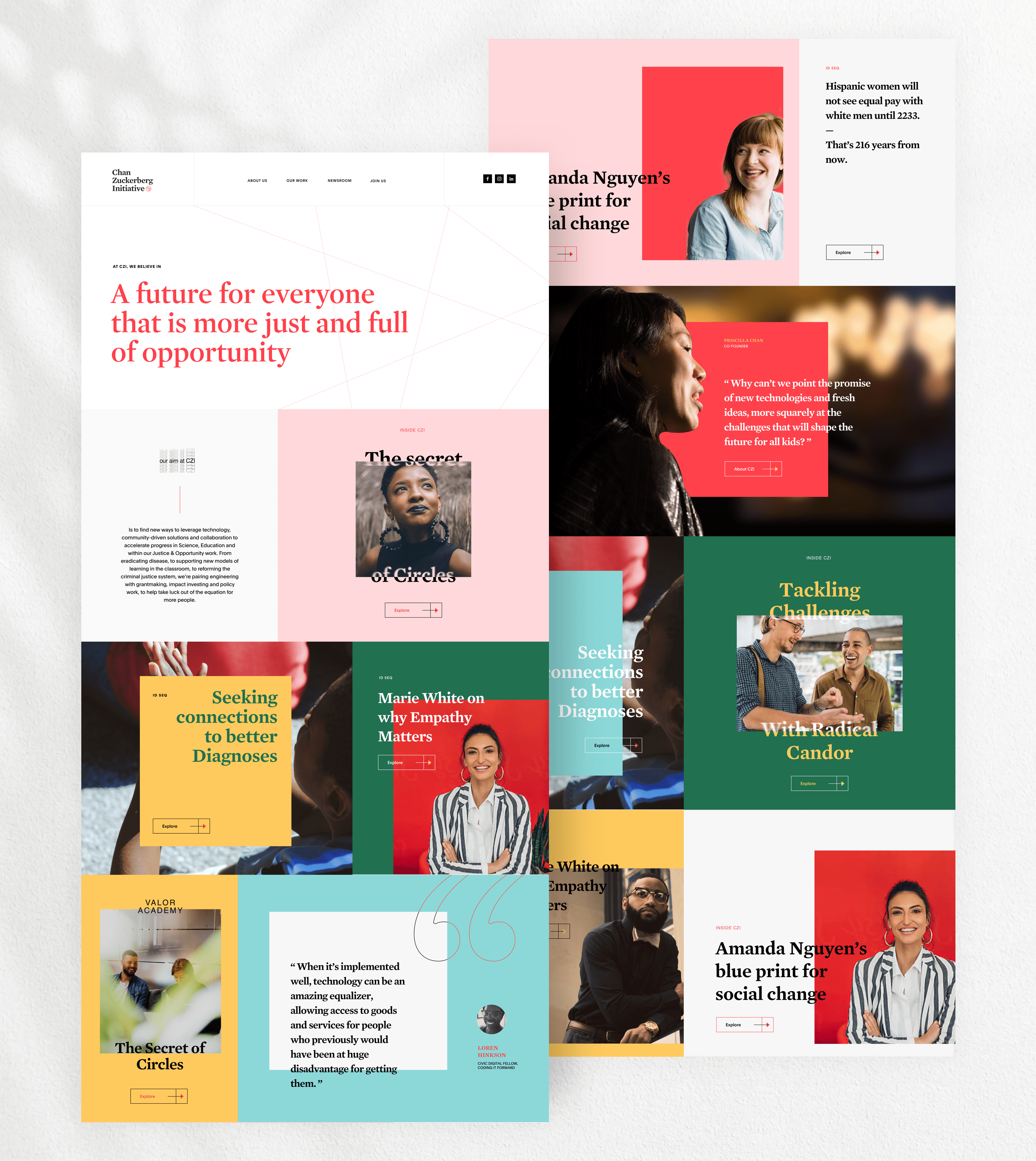
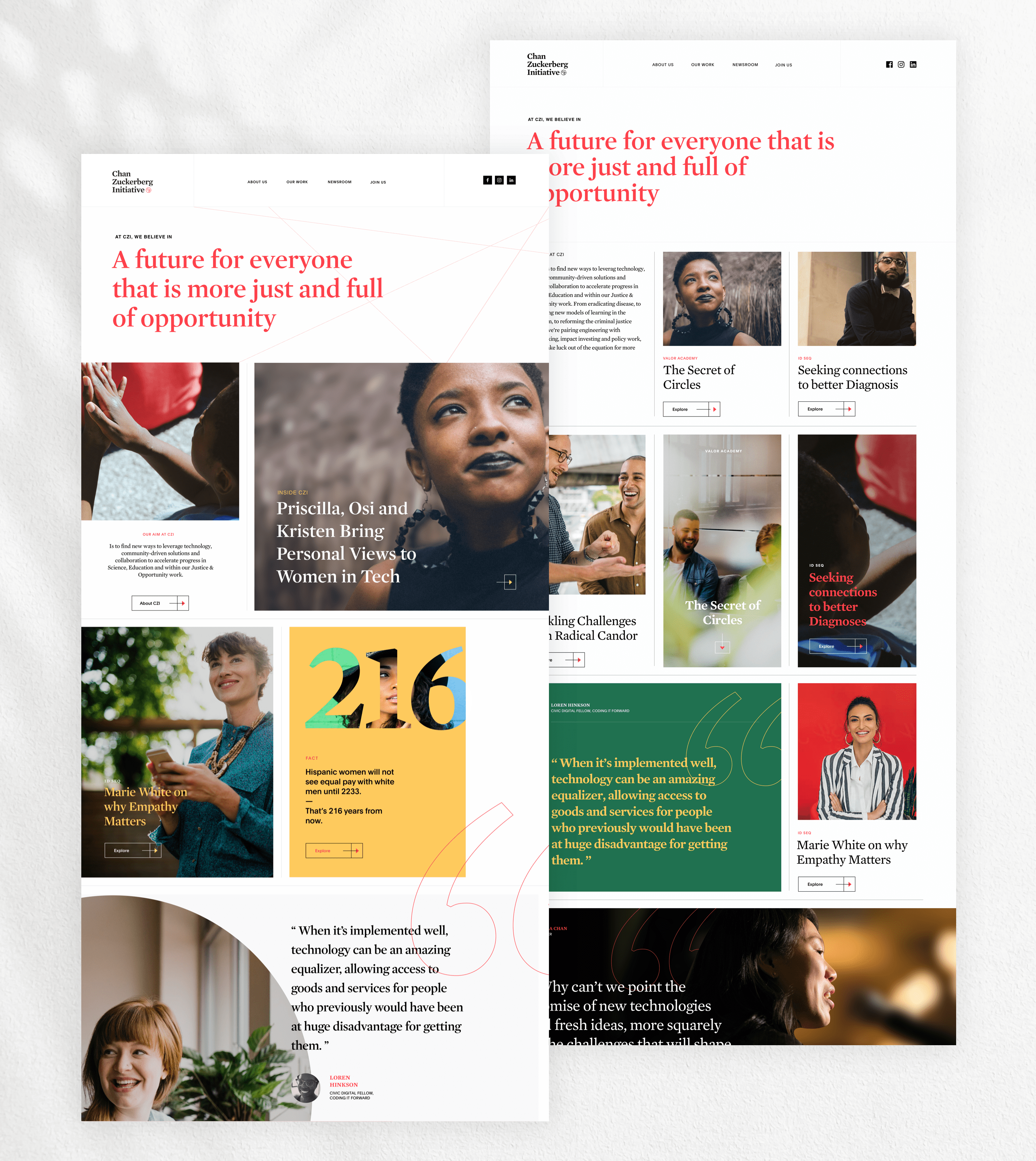
I was really proud that both the team and client agreed on basing the final designs on one of my previous explorations. One of the interesting thing we decided to adopt was to keep 'lines' connected throughout the pages. They represent the existing connection between the people and the community. I also suggested the illustrations to follow this concept by being drawn with only one continous line.
I was really proud that both the team and client agreed on basing the final designs on one of my previous explorations. One of the interesting thing we decided to adopt was to keep 'lines' connected throughout the pages. They represent the existing connection between the people and the community. I also suggested the illustrations to follow this concept by being drawn with only one continous line.
I was really proud that both the team and client agreed on basing the final designs on one of my previous explorations. One of the interesting thing we decided to adopt was to keep 'lines' connected throughout the pages. They represent the existing connection between the people and the community. I also suggested the illustrations to follow this concept by being drawn with only one continous line.
Moreover, colors are an important part of my designs as they represent the diversity and dynamism of the company. The blocks and the gridded structures throughout the pages are designed to carefully balance levity and gravity. One obstacle I found particularly challenging was to not fall into something too playful as it will be too far from our initial research insights.
Moreover, colors are an important part of my designs as they represent the diversity and dynamism of the company. The blocks and the gridded structures throughout the pages are designed to carefully balance levity and gravity. One obstacle I found particularly challenging was to not fall into something too playful as it will be too far from our initial research insights.
Conclusion
We brought a growing visibility and influence to CZI thanks to a distinctive website
We brought a growing visibility and influence to CZI thanks to a distinctive website
Talking to the people at CZI and hearing their stories was the best we could do in order to determine the pain points and improvements to make. The insights unveiled really allowed us to perfect our solution when it came to designing the website. One perfect example is the 'Story hub' designed on the homepage where each card is a meaningful story. It is rewarding to see that we were able to come up with this solution to give a voice to CZI's people and the community they serve.
Personally, I have majorly focused my reflexion around the feedbacks and the research initiated to imagine a solution that would both fit the business needs and highlight the culture of the company. My objective was to design a product that kept the seriousness of CZI's core goals without jeopardizing the dynamism and values of its people.